An identity that breathes the same space as the museum
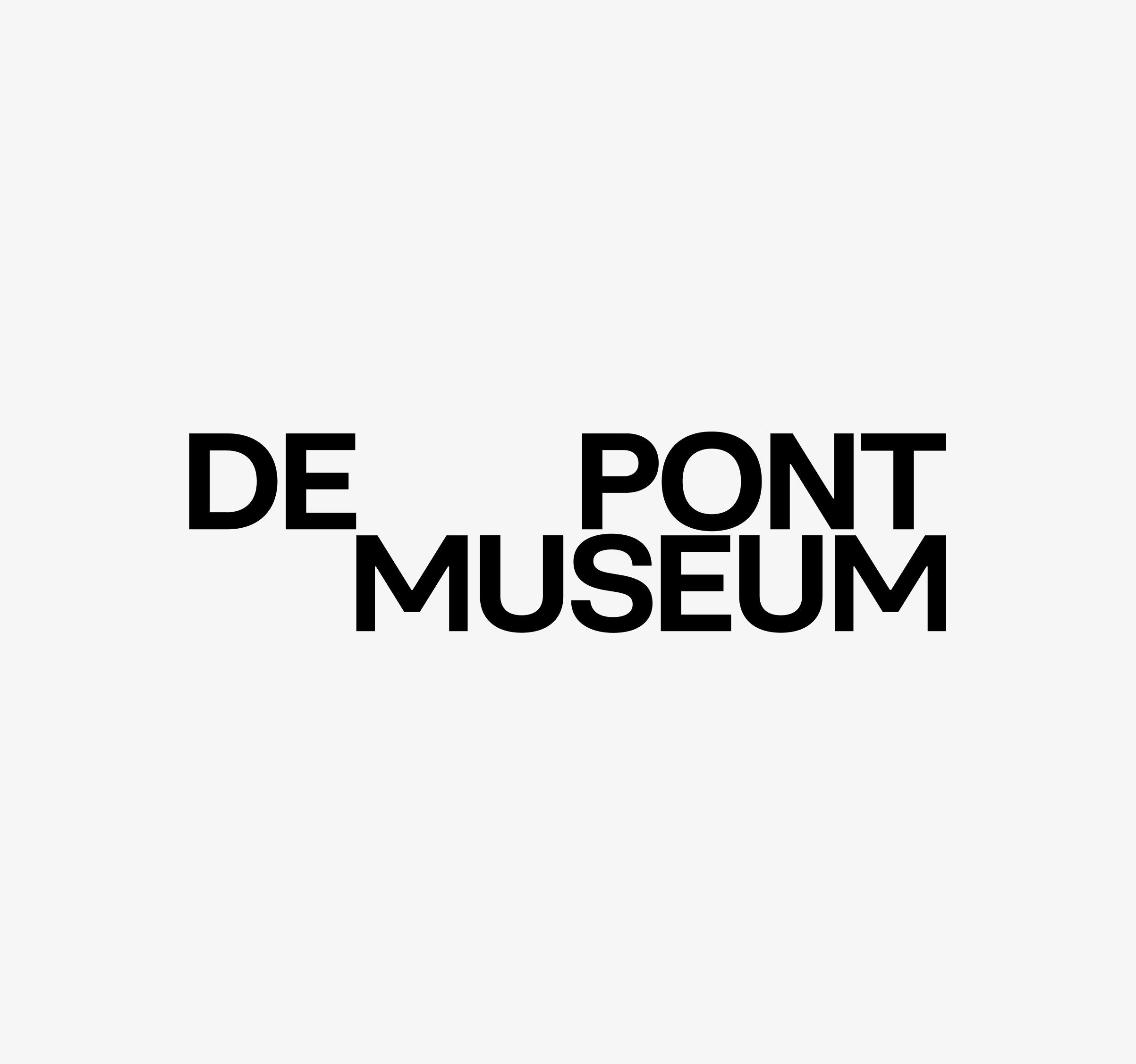
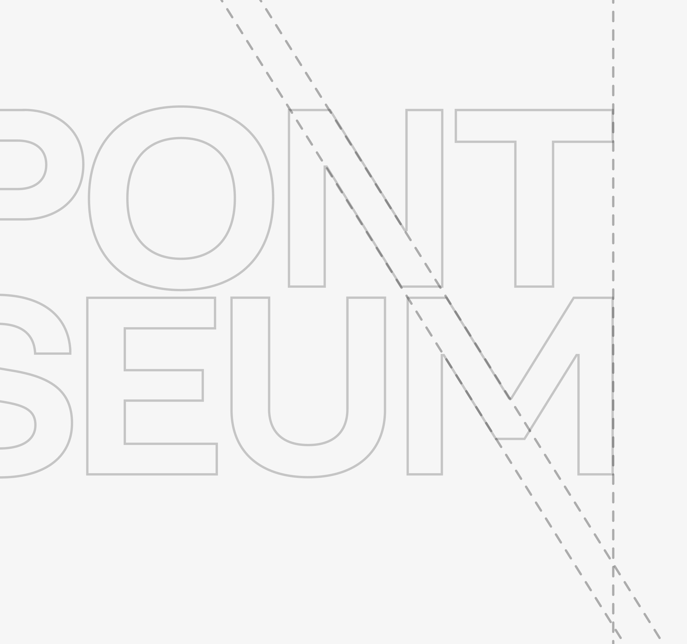
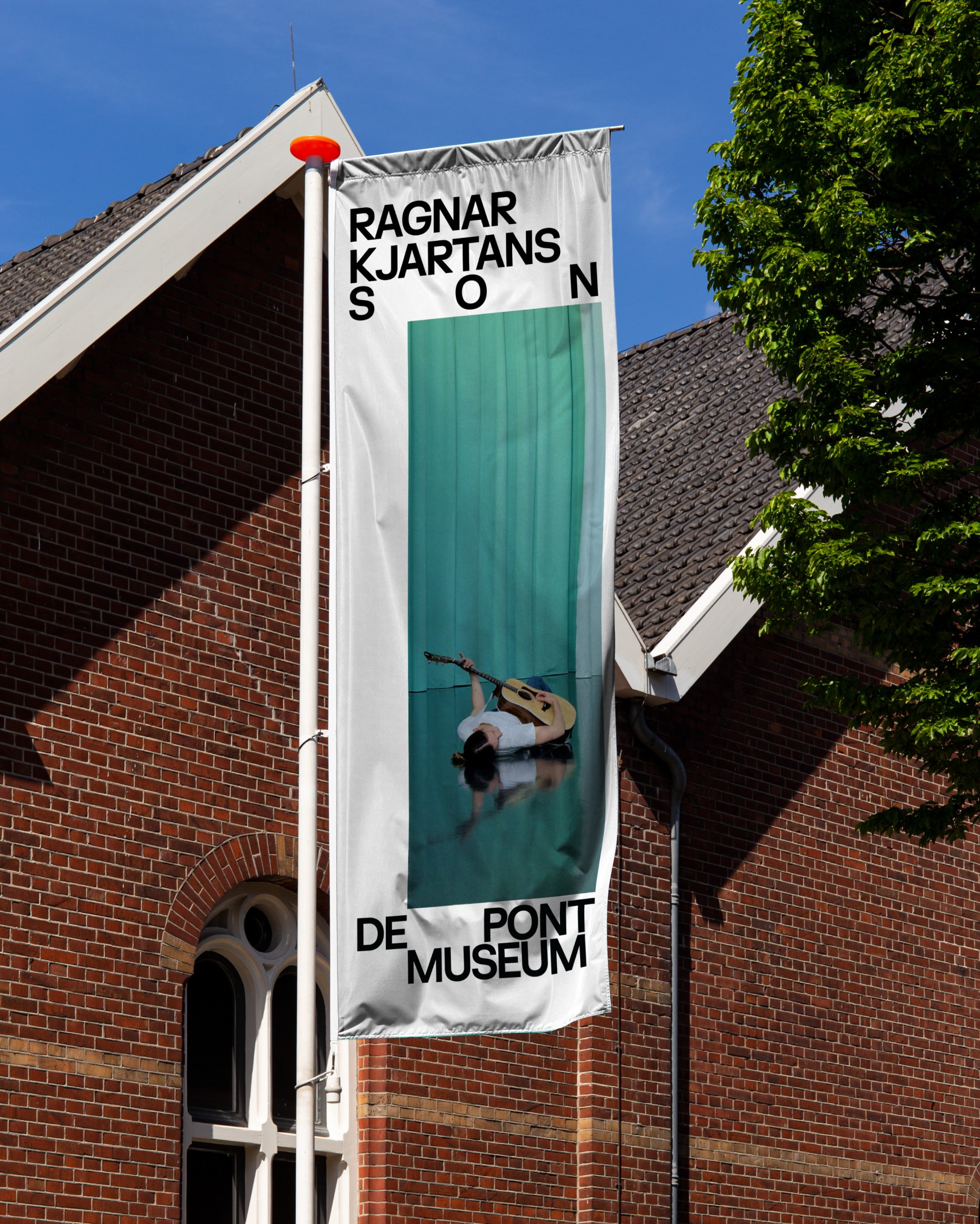
We won the pitch with a team of account executives. The result is a new identity for De Pont: a custom typeface drawn from the geometric and diagonal forms of the building, and a system where spacing is the design principle. Letter spacing and placement stay flexible, so every artist gets room, as they do in the museum. creative
De Pont adapts its building to the artist, not the other way around, with no fixed layout and no curatorial layer. The museum needed an identity that works on the same principle.
Pitch won as partner and director
Custom typeface drawn from the building
Identity built on space and flexibility
New identity for De Pont Museum
From pitch to execution in months